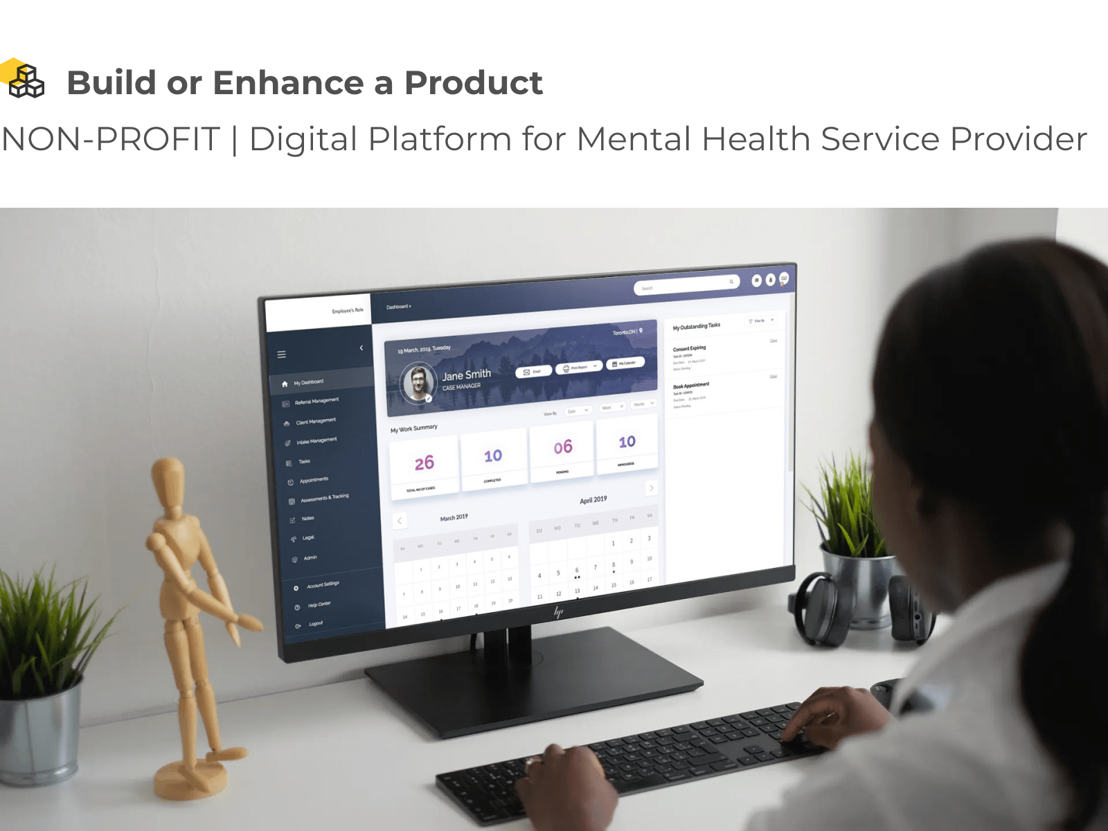
Life can be difficult for children living with mental health issues and those who care for them. Keeping track of appointments, conditions, prescriptions, and other complex needs across a multitude of disconnected organizations, systems, and in many cases, pieces of paper are challenging. These were the same challenges felt by our client, a leading Mental Health Service Provider.
Challenges
Looking for a better, more efficient way to serve children living with a mental health diagnosis and those who care for them, our clients felt that the older technology platform they used wasn’t able to deliver on the experience their stakeholders deserved. They turned to us to improve the customer experience, operational excellence and government reporting while ensuring patient confidentiality.
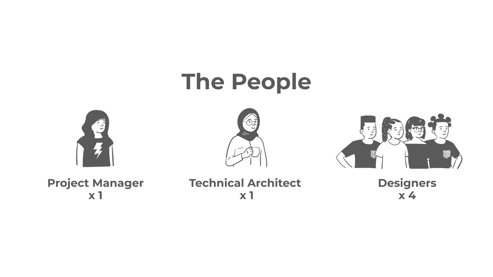
The People: 1 Project Manager, 1 Technical Architect, and 4 Designers
Requirement Gathering: Working closely with the client to understand the unique needs of the different caregivers and the children in their care, our teams collaborated with internal stakeholders to map out workflows and back-office processes to simplify and create a better, more efficient user experience. To do that, we first had to address several of our client’s challenges:
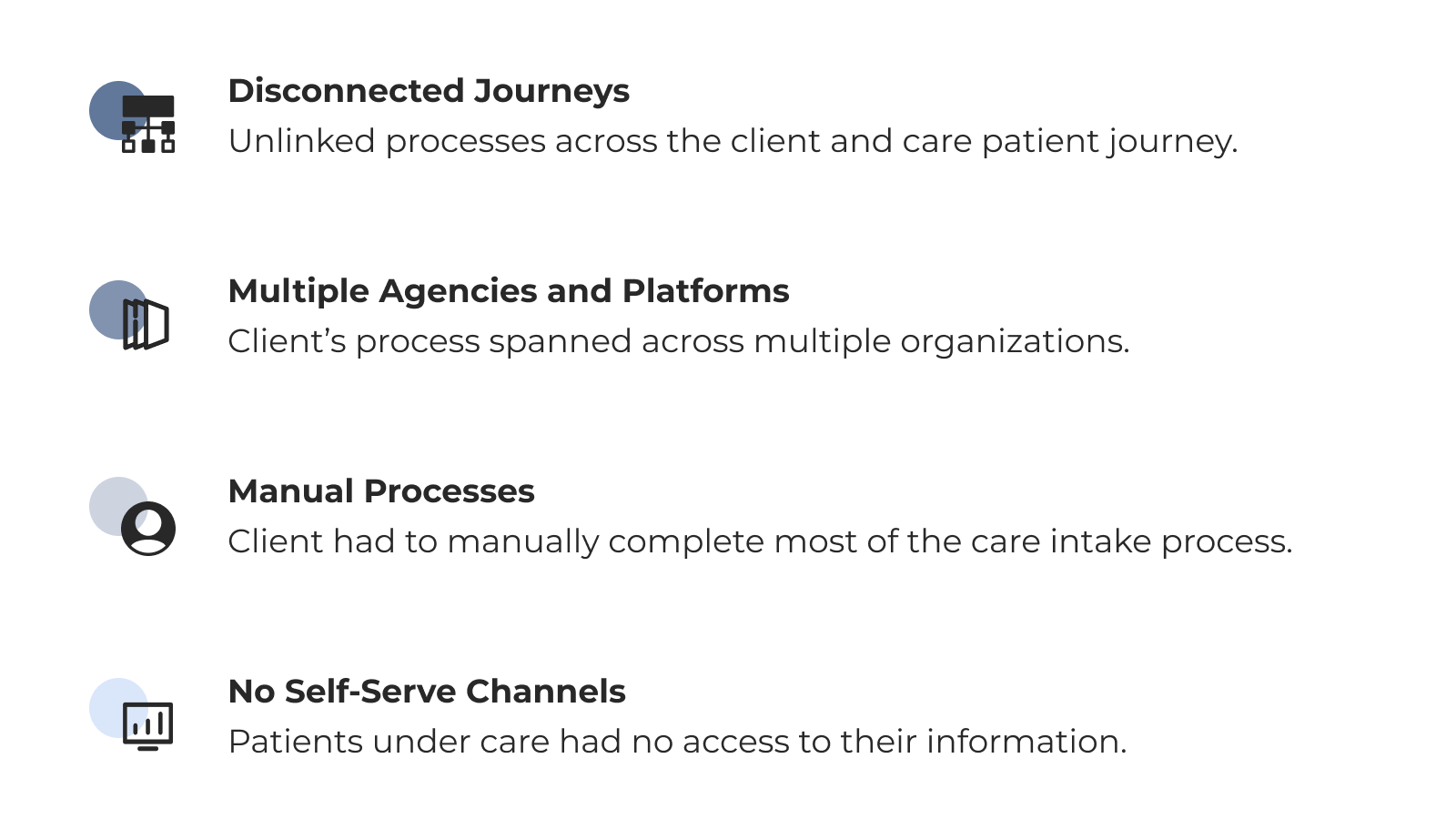
Disconnected Journeys.
Unlinked processes across the client and care patient journey.
Multiple Agencies and Platforms.
Client’s process spanned across multiple organizations.
Manual Processes.
Client had to manually complete most of the care intake process.
No Self-Serve Channels.
Patients under care had no access to their information.
Given the sensitive nature of child and youth mental health, this particular project required a more nuanced approach as there are intricacies that come with protecting children.
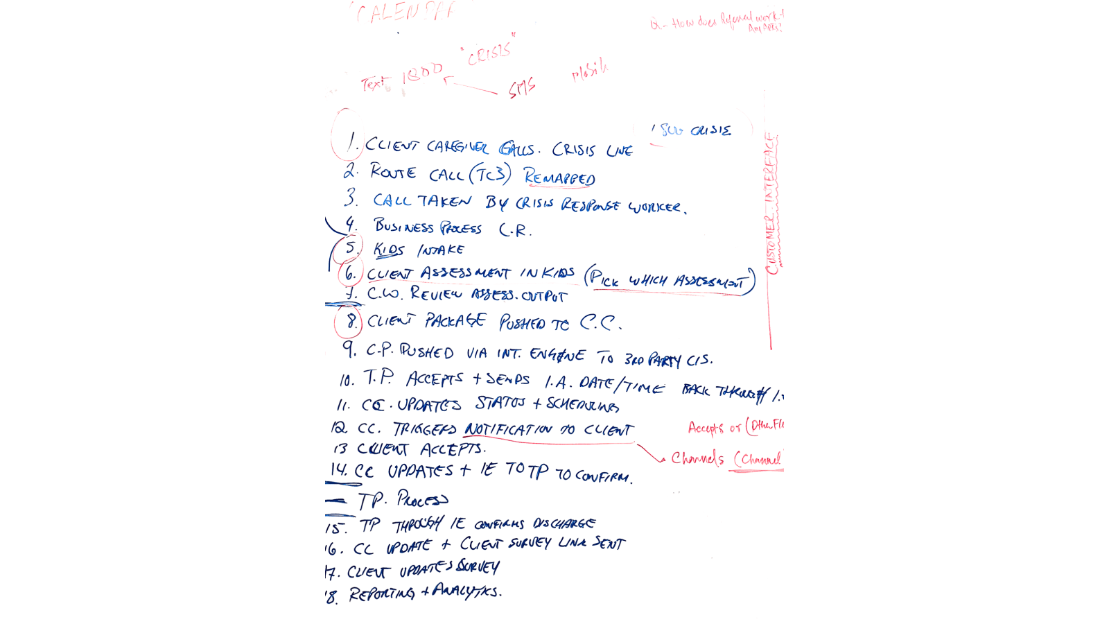
User Research & Insights: Our focus shifted next to the users: the employees and their clients, mapping out their and other key stakeholders’ roles in the overall process.
Personas were developed, the stakeholder map was elaborated on, and storyboards were co-created for the key processes.
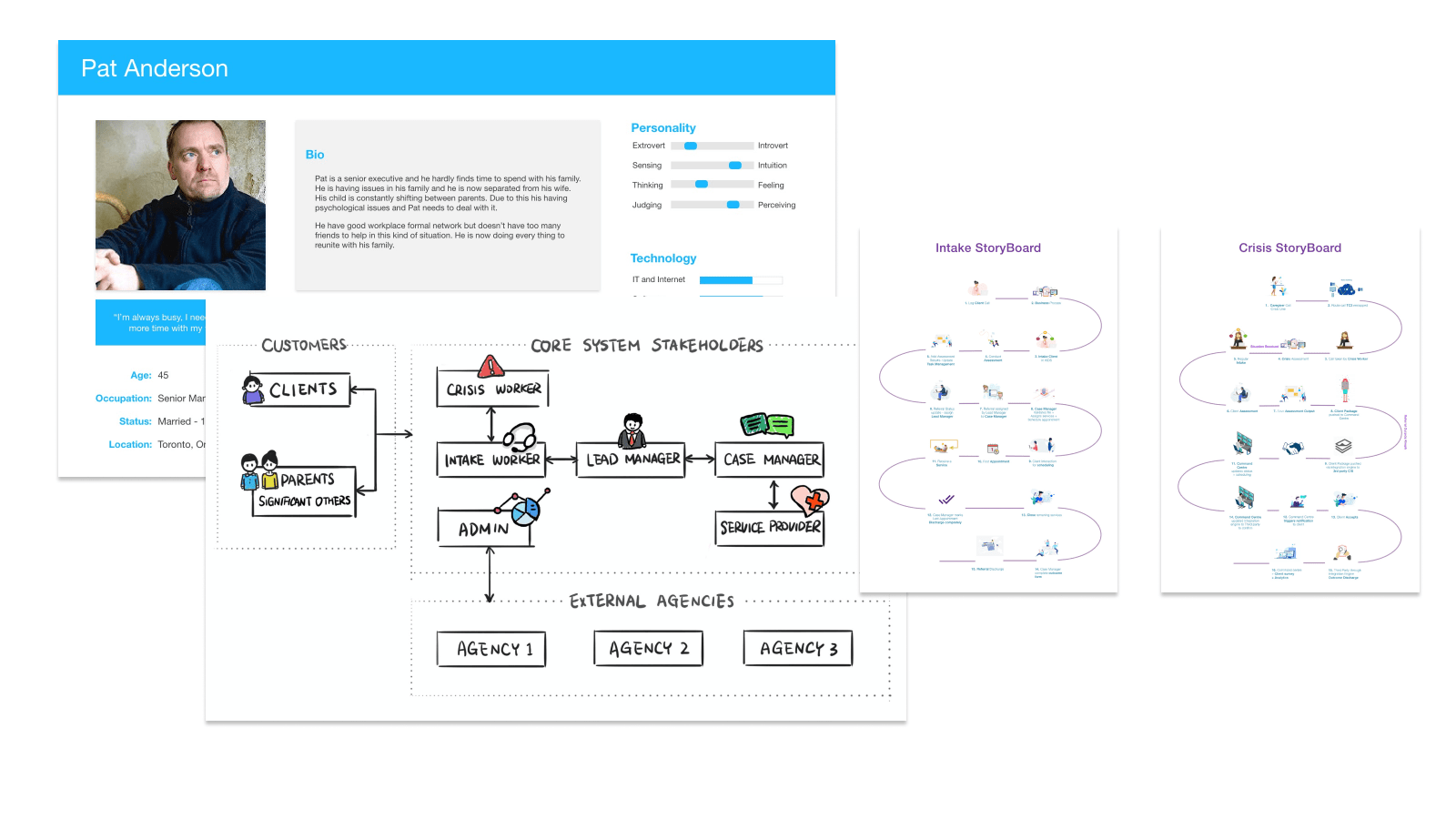
Based on the challenges, we determined product goals for the new design, brainstormed several solutions, and prioritized them for user-validation.
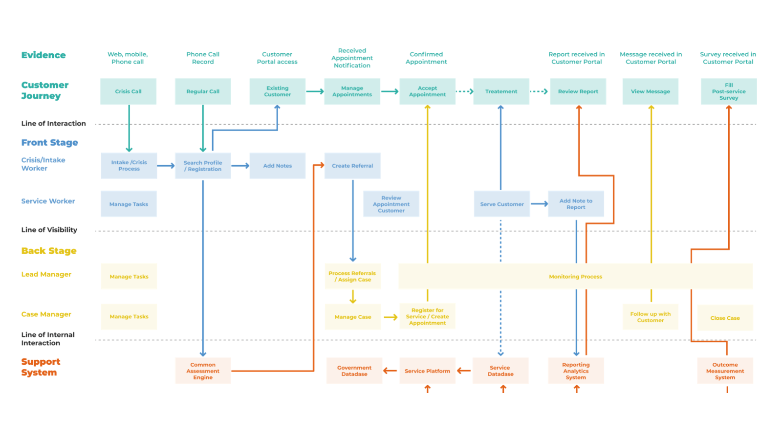
Service Mapping: After we had a deeper understanding of the customer journey and the back-office processes, we created a service blueprint to shape the overall picture of the new solution we were designing. This was instrumental in visualizing and simplifying the interactions between stakeholders at each stage of their journey.
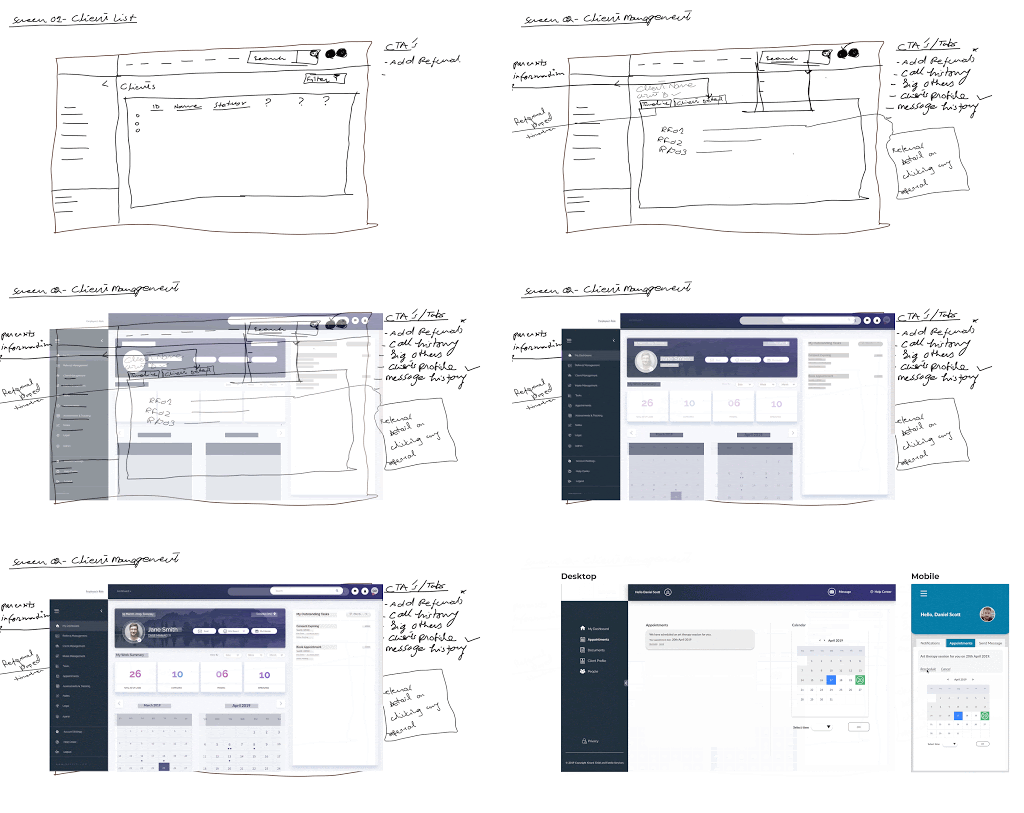
Concept Ideation: In our progression from low to high-fidelity, we started with paper sketches that had features prioritized on business and user requirements. Then we digitized the sketches into block frames for a more concrete view of the interface before we sought agreement on concept frames and moved onto high-fidelity mockups, adapted to various screen resolutions.
Prototyping: Having determined our client’s unique challenges, we were able to design a new user-centric Back-office and Client Portal.
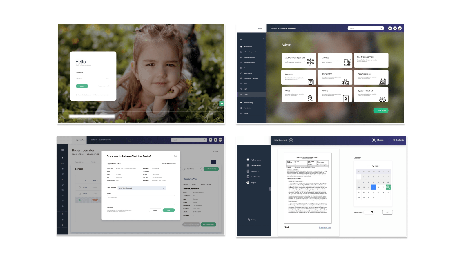
Together these unified crisis interventions and regular intake flow provided easy client/referral management. A central notification system provided a faster, more efficient workflow with better user experience and clear documented communication between stakeholders.
Simplified Experience: Our redesign significantly simplified the workflow for caseworkers by reducing the time between tasks. The patient profile was discovered to be a common point for all tasks and the redesign took this into account, displaying all options relating to the patient within the profile view.
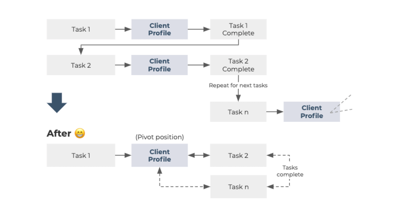
The patient profile was discovered to be a common point for all tasks and the redesign took this into account, displaying all options relating to the patient within the profile view.
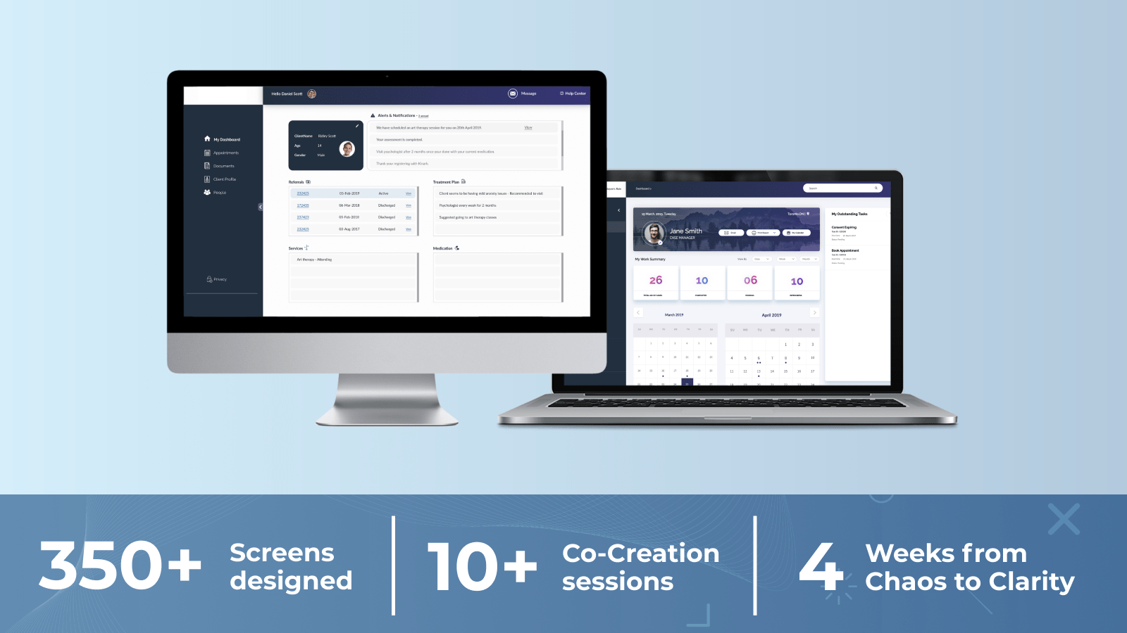
350+ Screens designed, 10+ Co-Creation sessions and 4 Weeks from Chaos to Clarity
Success/Impact
Working closely with the client, our redesigned experience significantly improved the functionality of the product. This translated to greater user experience and value felt across all stakeholders. Together, and in just under a month, we designed:
- Cloud-based case-management platform
- Mobile responsive customer portal
- An efficient and simplified back-office system
Our designs streamlined and simplified the workflow of caseworkers by establishing the client profile as a common point, keeping all related options and actions related to that profile in view of the user.


